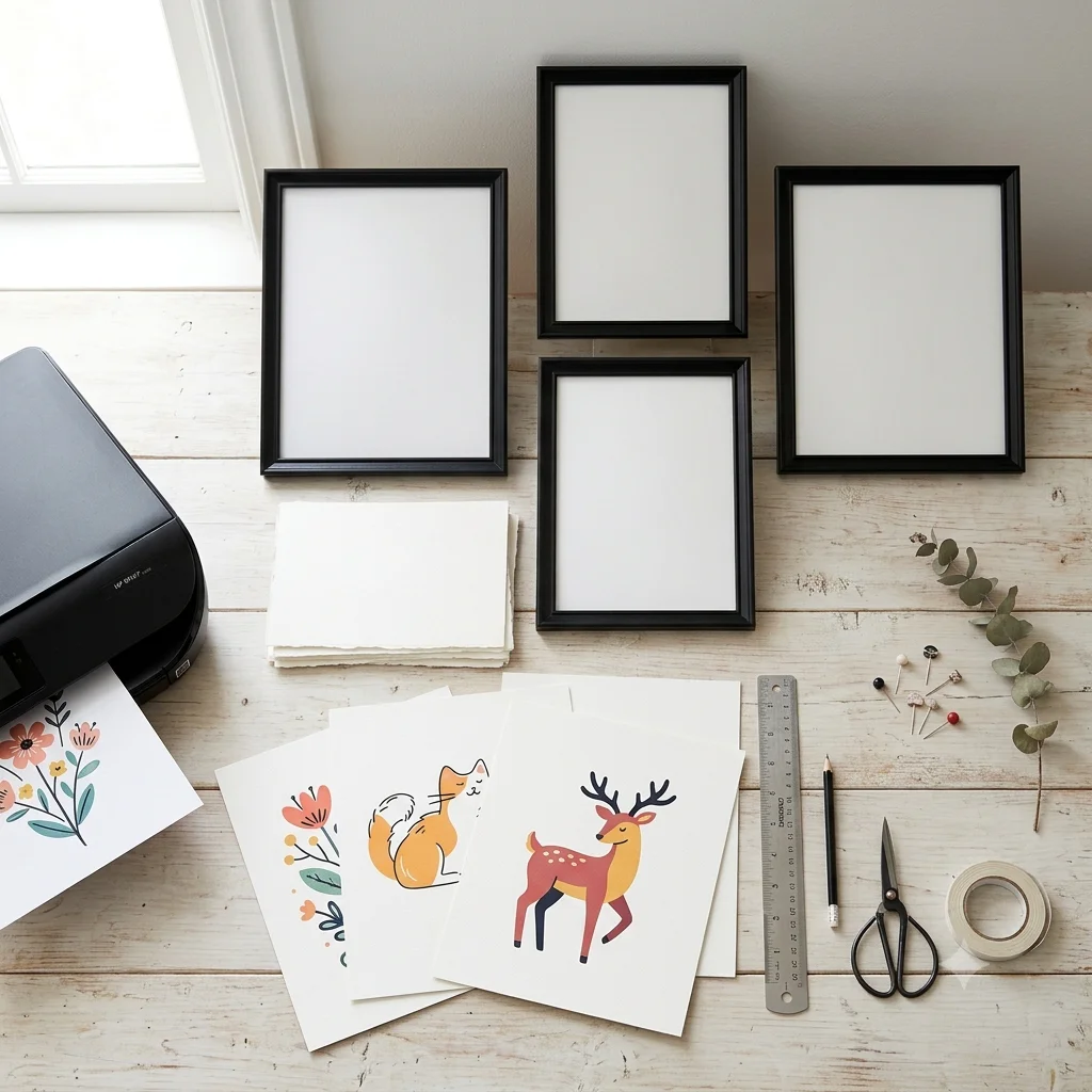
Decorating your living space to feel personal, warm, and sophisticated can often feel like an expensive endeavor. Between high-end gallery prices and custom framing costs, transforming blank walls is easy to postpone.
However, the rise of digital art prints—both free printables and affordable paid downloads—has completely revolutionized interior design. You no longer need a massive budget to curate a home that looks like it belongs in a magazine.
Here is your practical guide to balancing free versus paid art prints, along with budget-friendly secrets to making any print look like an expensive masterpiece.
The Power of Free Art Prints
Free printables are the ultimate secret weapon for quick seasonal refreshes, temporary apartment decor, or testing out new aesthetic styles before committing to a permanent theme.
- Best For: Holiday decor, seasonal art swaps (like autumn leaves or cozy winter scenes), trend testing, and quick DIY gallery walls.
- The Advantage: Zero financial risk. If you change your mind next month, you can simply replace the print with a new download.
- Pro Tip: Look for high-resolution files (300 DPI) to ensure crisp linework and true-to-life colors even on free downloads.
When to Consider Paid Digital Art
While free prints are fantastic for casual decorating, paid digital files often offer exclusive artistic collections, complex original illustrations, and ultra-high-resolution files designed for large-scale poster printing.
- Best For: Statement focal pieces above the sofa or bed, full gallery wall bundles with cohesive color palettes, and unique niche art (like vintage botanical illustrations or detailed pet portraits).
- The Advantage: You support independent artists while securing rare, high-quality files that come with multiple aspect ratio options for precise framing.
3 Budget-Friendly Hacks to Make Digital Prints Look Expensive
Regardless of whether your file was free or paid, the secret to a high-end look lies entirely in presentation. Here is how to elevate any home-printed artwork:
1. Master the Thrift Shop Frame Hunt
Skip buying expensive new frames. Visit local thrift stores, flea markets, or estate sales to find solid wood or vintage metallic frames for a fraction of retail prices. A quick coat of matte black or antique gold spray paint can make a $3 thrifted frame look like a designer antique.
2. Always Use a Photo Mat (Passe-Partout)
The single biggest difference between a “cheap poster” and “gallery art” is a paper mat board. Framing a smaller print (like an 8×10″) inside a larger frame (like an 11×14″) with a wide white or cream mat instantly adds sophistication, depth, and breathing room to the artwork.
3. Ditch Standard Copy Paper
Never print wall art on standard 80 gsm printer paper. Upgrade to heavy matte cardstock or cold-press watercolor paper (200–300 gsm). The rich texture and weight absorb ink beautifully, giving even a basic printable the look and feel of an original gallery painting.
Final Thoughts: Mix and Match for the Perfect Home
You don’t have to choose between free or paid options. The most charming homes feature a thoughtful mix: use staple paid art for your main focal walls, and complement them with fun, seasonal free printables throughout the year.





Leave a Reply